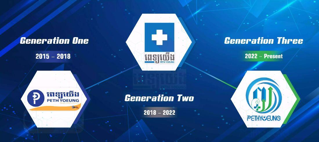


Generation One Logo:
Pethyoeung is the initiative and largest cloud-based software as a service for hospital operating management system and telemedicine platform to successfully make positive health impact in the Kingdom. Behind the success of Pethyoeung startup from its inception is the visionary and women-oriented tech company, First Womentech Asia (FWTA). The very first logo of Pethyoeung included our visionary company’s “FWTA” logo when the logo was the representation from 2015 to 2018. Pethyoeung’s operation has been concentrated on the initiative of FWTA, whose vision is to empower young women and men and to solve their pain points in the health and technology sectors. As a new technological innovation, Pethyoeung is a highly-efficient digital solution for any types of healthcare service operators and patients in Cambodia.
Generation Two Logo:
Pethyoeung second logo was the main symbol to represent Pethyoeung’s journey and success nationally and internationally from 2018 – 2022. As Pethyoeung’s digital and health impact was widely known, the team has grown significantly beyond the original initiative of FWTA which is specifically and strongly women empowerment. The featured Khmer language showcases to the world our national pride ‘Khmer identity’, a team of innovative Cambodian developers and a Cambodian digital health contribution.
Generation Three Logo:
Throughout the years of local and international success, Pethyoeung revolutionized our symbol for the second time in regards to representing a new identity. The necessity to change is to introduce a logo more visible to the public and concentrated on our long term business vision. Pethyoeung maintains the same mission and vision which are to solve and enhance healthcare quality, accessibility for all people anywhere. In our latest logo evolution, we highlight two Khmer alphabets “ព” and “យ” standing for “ពេទ្យយើង” translated as “Our Doctor”, which means “the professional who helps and rescues lives”. The cross sign symbolizes healthcare services being facilitated for all persons; the two dots two people; and the unattached circle three parts of the world accumulatively being earth, a home ground for people who also need healthcare giving that healthcare is a basic need to everyone. This new design is an era when Pethyoeung finally obtained a trademark registration as an independent company besides FWTA, our visionary company. Meanwhile, we continue to contribute to enhance healthcare and well-being of human life.